最近在使用Flowable做工作流相关的项目,其中涉及到流程表单的设计。Flowable自带的表单设计器支持的组件类型只有常用的几个Input组件和一些样式组件,而在具体项目中需要用的特殊组件就不支持了,需要进行自定义。

准备
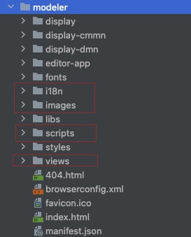
自定义表单组件主要涉及Modeler设计器中的页面,具体包含以下文件:
- scripts/controllers/form-bulder.js
- views/templates/form-builder-element-template.html
- i18n/zh-CN.js (这个是国际化文件,可以根据自己使用的语言进行选择)
- scripts/services/editor-directives.js
- views/popover/formfield-edit-popover.html
- images目录
操作步骤
以下以自定义订单详情组件为例进行演示:
1、打开scripts/controllers/form-bulder.js文件,找到$scope.palletteElements代码的地方,在数组的最后增加一项:
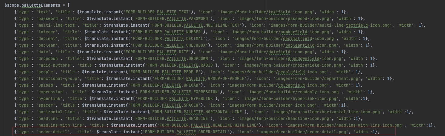
字段含义:
- type表示组件类型,icon表示图标,需要先把图片放到images目录中;
- 'title': $translate.instant('FORM-BUILDER.PALLETTE.ORDER-DETAIL')表示组件在页面中显示的名称,需要在i18n文件中配置。
2、打开views/templates/form-builder-element-template.html,在最后增加一个div,可以参考上面的进行修改:
字段含义:
- ng-switch-when="order-detail"表示组件的类型;
- placeholder="{{'FORM-BUILDER.LABEL.ORDER' | translate}}"表示组件的placeholder值,需要在i18n文件中配置,其他的元素按需配置。
3、接下来就是配置i18n文件,由于我使用的是中文,所以配置zh-CN.json文件:
- 在
FORM-BUILDER–PALLETTE增加一个节点:ORDER-DETAIL:"订单详情" - 在
FORM-BUILDER–LABEL增加一个节点:ORDER:"选择订单..." - 将订单详情组件的icon图片文件放到images目录
4、如果需要对组件增加选项,比如是否选择多个等,需要在以下文件里配置:
- 打开
views/popover/formfield-edit-popover.html,参考其他组件,在其下面增加以下代码
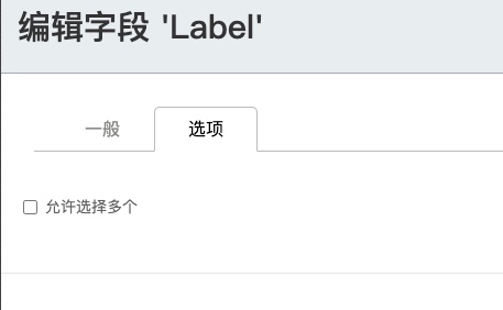
表示在order组件的选项卡中增加是否支持选择多个选项,此选项卡的id为custom-option选项卡。
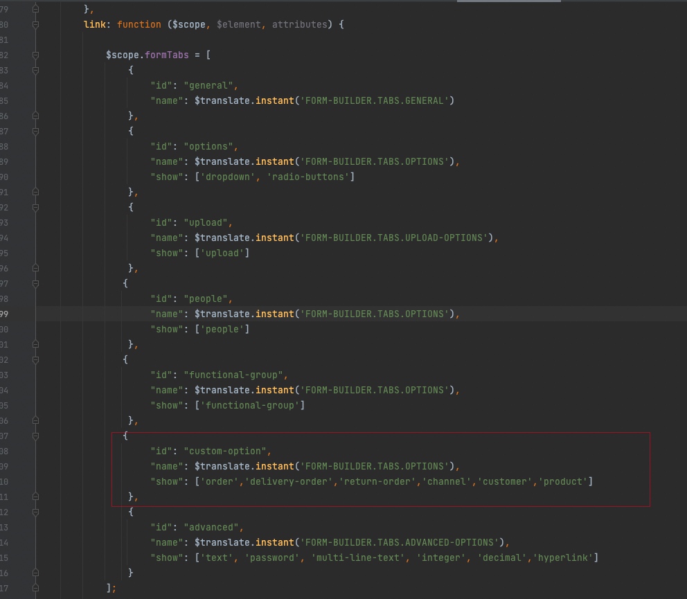
- 然后打开
scripts/services/editor-directives.js,参考其他选项卡设置,增加一个选项卡配置,并将组件添加进去即可
总结
到此,自定义一个简单的表单组件就完成了,重新将代码发布,然后打开表单设计器,就可以看到自定义的表单组件了。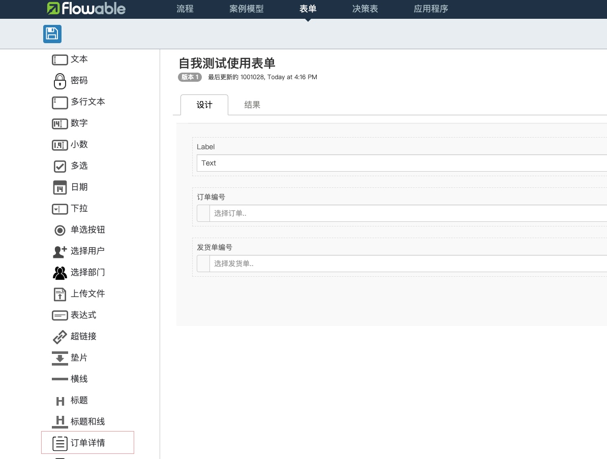
原创文章,作者:诺多,如若转载,请注明出处:https://www.huluohu.com/posts/137/
 微信扫一扫
微信扫一扫  支付宝扫一扫

